Data visualization is a key facet of any organization’s master data management system. While garnering those analytics and insights is important to make for better business decisions, it’s just as important to be able to clearly display that through graphs and charts that articulate the message. One of the ways this is accomplished is through a treemap chart, a visualization technique that displays hierarchical data using rectangles of decreasing sizes. Here are just some of the types of data that can be demonstrated through treemapping.
1. Sales Figures
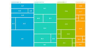
One of the examples of treemap charts that are quite common is to monitor sales. Numbers can be compared across a variety of industries to monitor numbers side-by-side for different brands and models over a certain timeframe. This can make for great use of a two-dimensional treemap chart. Data in a treemap is represented using rectangles. To properly display sales numbers in a given scenario, the rectangles in the treemap will be arranged according to size. The standard format is that the size goes from the top left corner, flowing to the bottom right.
Each rectangle represents two numerical values. You may sometimes hear these rectangles referred to as “branches” or “nodes,” with the nested datasets within considered “leaves.” Each rectangle is colored in shades of the highest level category. However, this is only necessary when the treemap represents data alone, and other color variants may also be used when designing treemaps.
The plot area is where visual representation takes place. The colorscale can be treated as a spectrum to determine the range of which sales data stands out within a given marketplace.
2. Relative Population
Local, state, and federal governments can actually turn to treemap charts to get an assessment of the population region. Treemaps can be used to reflect population density within a county, trending growth over a set time frame to show population migration. Data within treemaps can be multi-layered. Hierarchically organized datasets are usually depicted as a set of nested rectangles. The “parent elements” will be tiled alongside the “child elements.” Parent elements could refer to a dependent variable such as the counties within a state, while the time period to assess growth can be viewed as the independent variable in a two-dimension setup.
A treemap will help viewers to analyze the context of two quantitative values. Oftentimes, the dimensions of these rectangles correspond with one aspect of these data sources. This allows for the visualization of this information with different variables presented in a way that’s easy to understand. When it comes to plotting tens of thousands of data points, treemap charts have the edge over other charts frequently used to represent hierarchical data.
3. Inventory
Retailers may turn to treemap charts to monitor inventory at all of their locations, tracking sales compared to products on hand while also seeing what drives a particular region or city’s customer base. When a quantity is assigned to a given product category, the area size of the rectangle is proportionate to that quantity. Data analysts will convey these panels and rectangles with the help of a legend, distinguishing one data series from another to represent categories.
A treemap chart identifies trends and patterns between the nodes of all the categories represented in addition to datasets within the inner mechanisms of a supply chain. The utilization of space allows for analysts to drill down important information that can benefit production for companies. This helps to accurately display multiple elements at once in as clear a picture as possible to bring the different branches of workflow to light, making for greater and better decision-making.